A new visual direction for Atlas & Voxhall
We redefined the visual identity for the world famous music venues, Atlas & Voxhall. Our approach honored the venues' authentic spirit while modernizing the core visual elements that define their legacy.
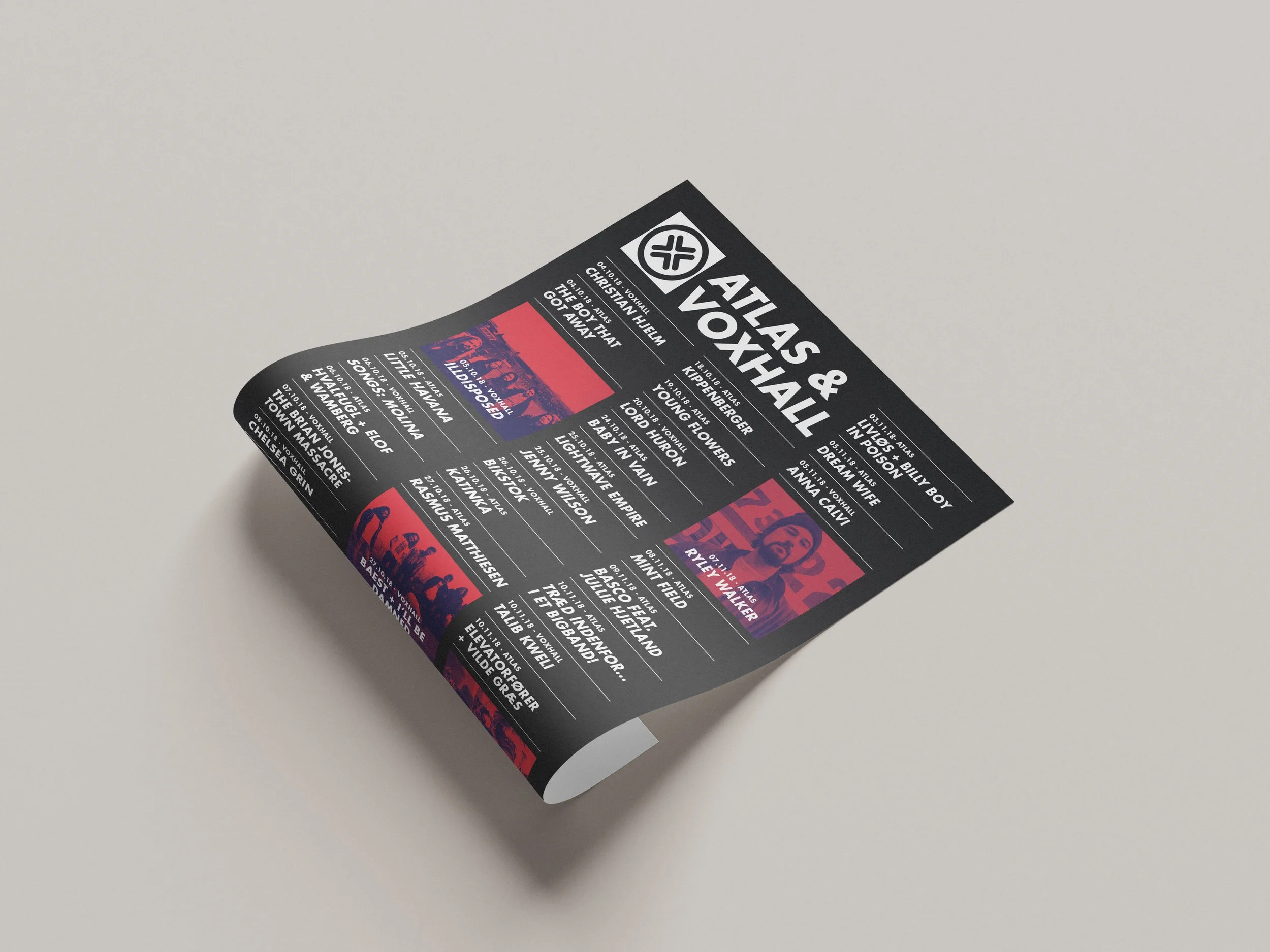
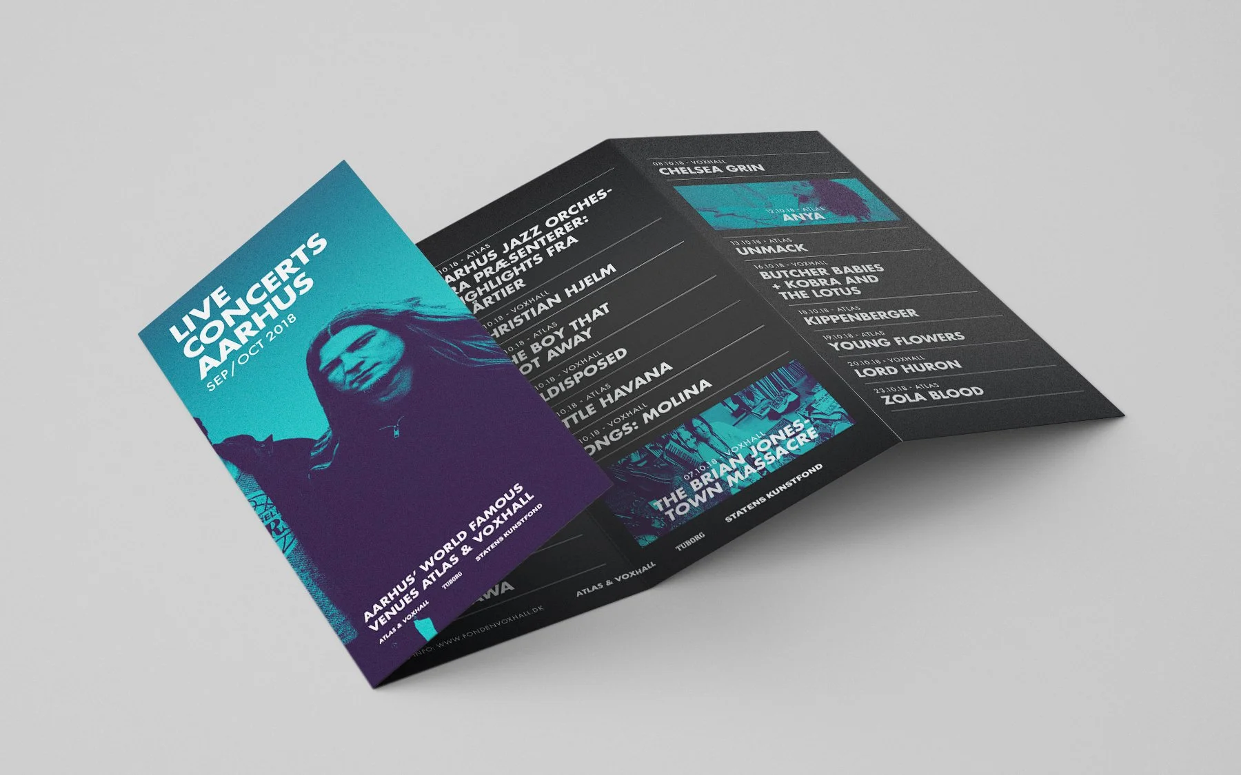
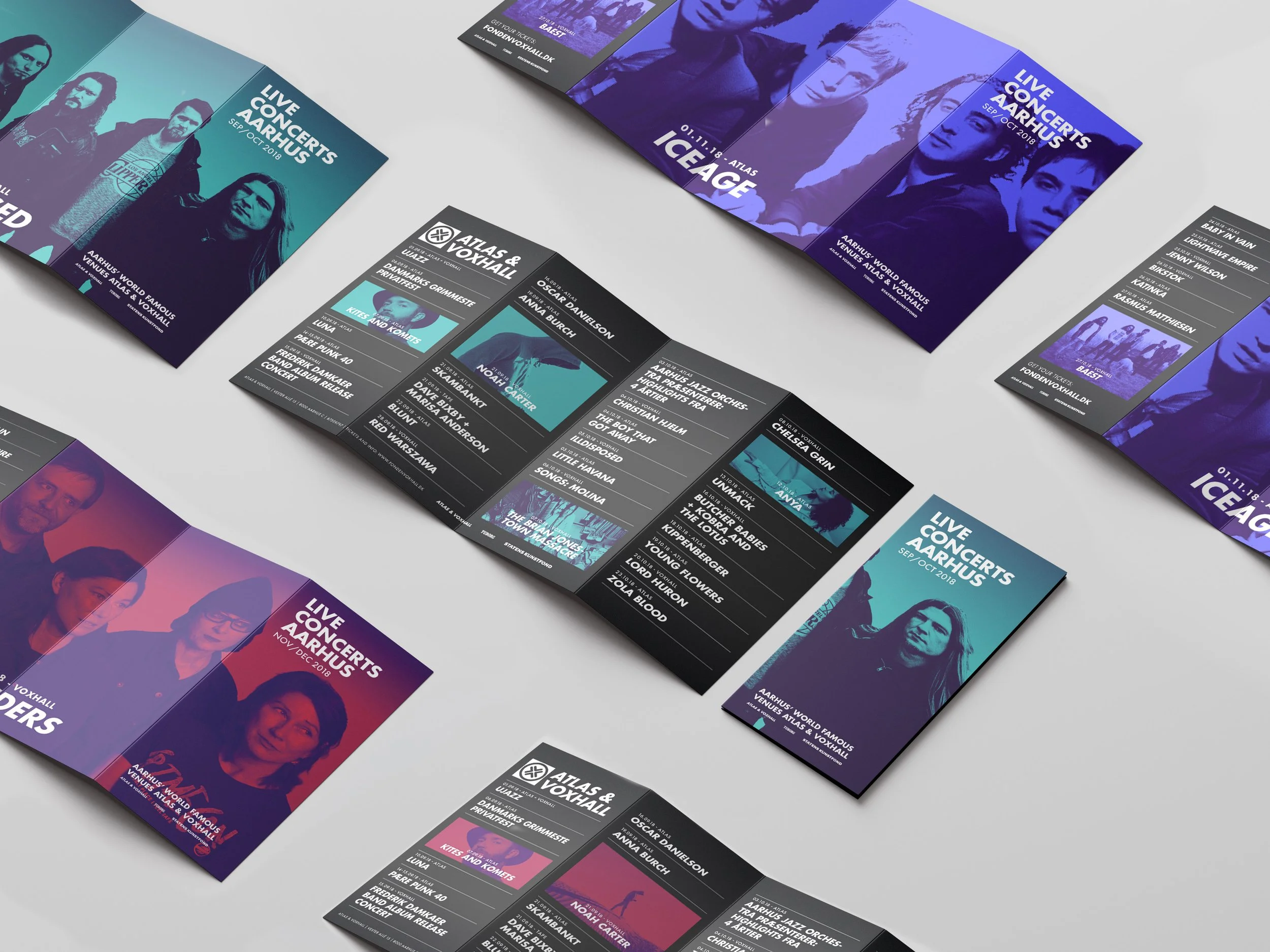
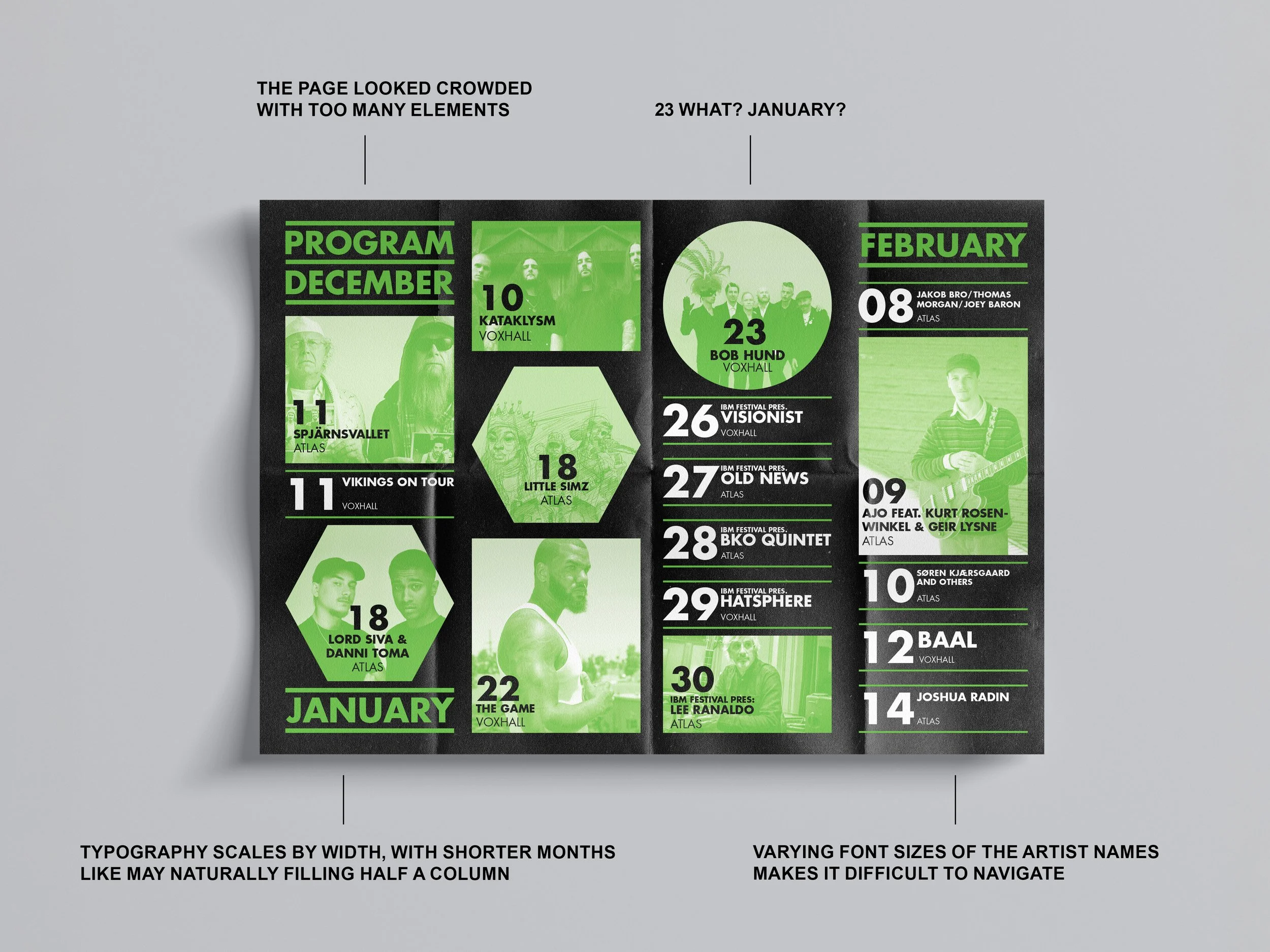
The original program layout suffered from a cluttered hierarchy, where an overload of elements and inconsistent typography made it difficult for the reader to navigate. Artist names appeared in varying font sizes, and the flexible scaling of month names - where short months like May filled half a column - created a fragmented visual flow. Furthermore, the production was unnecessarily costly due to a complex, custom fold that added to the budget without improving the user experience.
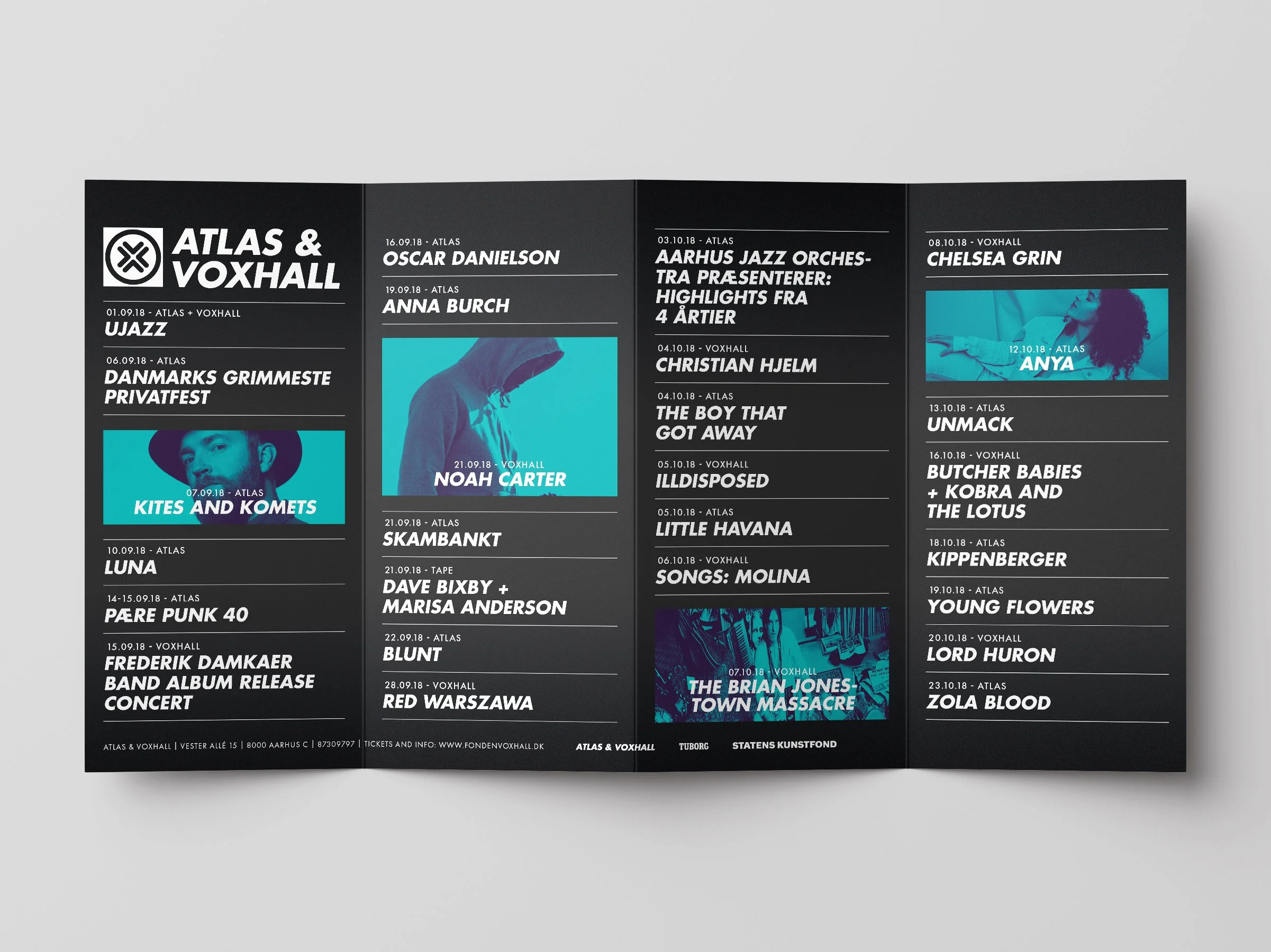
The new identity establishes a clear and intuitive hierarchy. We standardized font sizes for artists and dates to improve readability, using color exclusively for headliners to make them stand out within the calendar. Additionally, the gradients were refined with more depth to give the layout a sense of music and night life.